when i started blogging i was pregnant and i had no idea what i was doing. i've always kept some sort of online journal (what's up livejournal) and wanted to blog about my favorite baby products, etc. through that my dear friend lauren asked me if i wanted to blog for pregnancy and newborn. although i have not made substantial money through blogging i've had a lot of great opportunities because of it. i kept up with homemade grits to catalog matilda's first days and to keep my family posted on our family happenings. eventually i started learning to use a dslr and my blog started looking more professional which leads me to...
blogging tips + tricks part 1: photography
one of the main differences between a hobby blog and a more professional-looking one is a good camera. if you are going to invest in one thing for your blog it should be that. in my opinion. also, i like taking pictures on my phone as much as the next person but blown up they never look good. look at the difference between these two pictures of matilda:


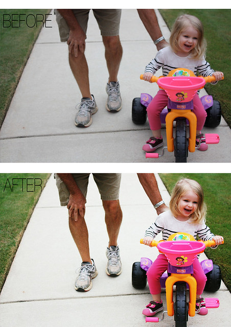
let's compare this straightouttathecamera photo and the one i edited in picnik:
if you have photoshop, the pioneer woman has great actions that are free. for a really helpful tutorial on actions check out this post.
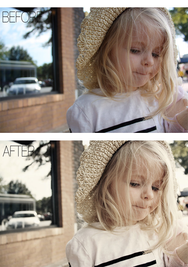
ex of before and after using actions (pw's colorized action with the opacity tweaked for each layer):
also, with pictures i really appreciate larger photos. you get so much more of "the picture." i have set the width of all of these photos at 600 which you can do with some very basic html. you'll want to make sure that the main body of your blog is at a width of 600 or higher, otherwise the image will be cut off.
img width=600 src="inserturl" surround this text with <>. teach yourself basic html. here's a good site to get you started. again, look at the difference:
width of 300:
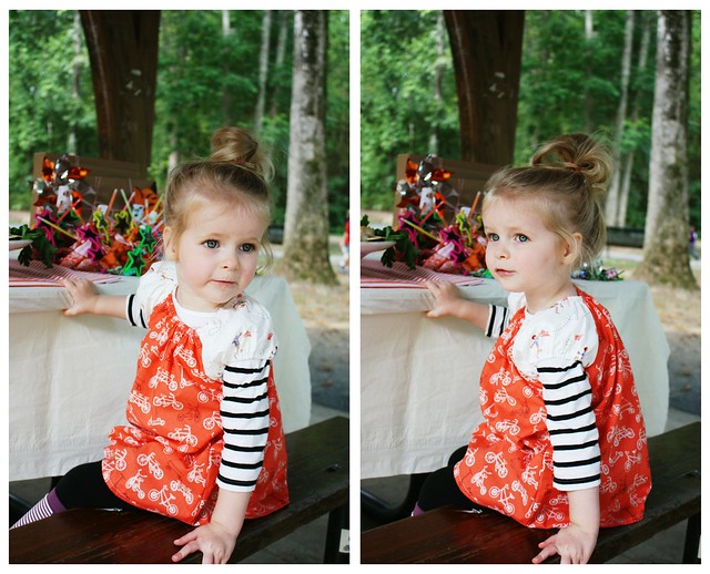
width of 600:

let me know if you have any questions. again, these are my preferences and what i look for in blogs i like to read.
um ps can you tell how much i like that striped shirt?!

10 comments:
EVERYONE. Everyone everyone. Should read this.
I really (probably overly dramatic of me) hate to see tiny, grainy blog photos when They could be great with a few tweaks.
i love your beautiful pictures of matilda!
these videos are great for learning basic HTML stuff too: http://www.dontfeartheinternet.com/
Yay! Thanks for this post. I am really wanting to improve my photog skills and the whole photoshop thing is a bit overwhelming, but so necessary (yes, i started with pw's intro. then got a bit lost). And, yes, I am loving that striped shirt too! What brand is it? Might just have to get one for my little one!
So helpful! I have SO much to learn! And, I never even noticed the shirt was the same til you mentioned it! Is that bad?
thanks for your blogging expertise!
@kate yes LOVE their tutorials!
@heather NO, i'm glad you didn't notice. haha.
@erin photoshop is totally overwhelming. i'm hoping to learn a lot from that book. the shirt is from gap but it looks like it's no longer available...
I love your tip about vertical shots. The asymmetry has always bothered me but it never occured to me to just add another photo. Genius, I say.
What a great post! I'm a newbie blogger, and I always appreciate tips on how to improve. Do you have any preferred templates for blogger? I always have a difficult time posting pictures with the template I currently use, and I really like your tip about the vertical pictures.
Thanks for sharing your wisdom!
@ FlibbertyGibbetry i use the minima lefty layout but i've changed a lot of the html to give me three bars. the best way to post pictures is to use html. i use flickr to store all of my photos and then get the html from there. you could also use photobucket. hope this helps!
SNAP! Thanks for the link :) <3 I'm liking this series!
Post a Comment